line of sight

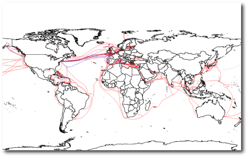
The ring of geosynchronous satellites and the global web of submarine cables constitute two of planet Earth’s most remarkable physical features. The moment I press Publish, the diagram just below will be sent — encoded in modulated light — on a profusion of undersea journeys from the Bluehost servers in Utah to Japan, Europe, Australia, South America and beyond. Optical wavelengths are small, the speed of light is fast, and the quantity of data that can be transmitted on optical fiber is impressive. A fairly recent lab-based data transport record involved multiplexing 155 channels, each carrying 100 Gbit/s over a 7000 km fiber.

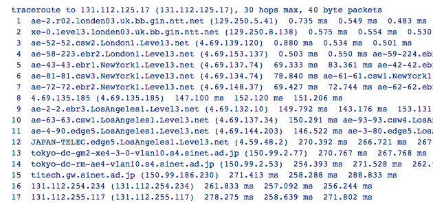
For the impatient, however, the latencies of the long-haul international fiber connections are something of an issue. The index of refraction in glass is n~1.5, and the cable routes don’t adhere to the great circles. Using NTT’s Looking Glass service, one can run traceroute between far-flung nodes on the Internet. For example, right now, round-trip travel times between London and Tokyo are taking about 265 milliseconds, with routing that runs on the Atlantic and Pacific Ocean bottoms and (effectively) along Route 66:

A quarter of a second round-trip is pretty slow. Light traveling in vacuum along the 9602 km great circle connecting London and Tokyo would do the round-trip in 64 milliseconds, a factor-of-four improvement. Things should get better in 2013, however, when the Arctic Link cable connects Japan to Britain via the Northwest Passage. This line will run at 170 milliseconds round trip.

Even with global warming lending a helping hand, it’s a hassle to lay cables over the top of the planet. A more effective plan is to go straight through. The straight-line distance through the Earth from London to Tokyo is 8719km, implying a minimum round-trip of only 58 milliseconds.

It was thus rather interesting to read of the first actual demonstration of signaling by neutrinos posted to arXiv earlier this month. A team at Fermilab reports that they have established a neutrino communication link with a data rate of 0.1 bits/sec and a bit error rate of 1% over a distance of 1.035 km, along a path that includes 240 m of solid Illinois dolomite.

A one or a zero every ten seconds is very similar to the bit rate that one gets with smoke signals. It’s a staggeringly long way from the petabit-per-second transmission rates that one can currently achieve with a strand of freshly lit fibers. Nonetheless, it’s an exotically high-tech accomplishment, and so it’s fair to overlook the abysmal bandwidth and error rate. What I would like to criticize, however, is the completely lame initial message that was transmitted over the neutrino link: N-E-U-T-R-I-N-O.

Jeez. Did none of the 113 authors of Demonstration of Communication Using Neutrinos appreciate that style is paramount when one is performing expensive high-profile stunts?

In Stancil et al.’s defense, though, the contents of historic first messages have generally been sorely lacking in pizazz. Alexander Graham Bell’s first telephone call consisted of “Watson, come here! I want to see you!” Even worse, was the unreadably uncompressed purple prose transmitted (over the course of 19 hours) on August 16, 1858 as a part of the first transatlantic telegraph messages between Queen Victoria and President Buchanan:

“it is a triumph more glorious, because far more useful to mankind, than was ever won by conqueror on the field of battle. May the Atlantic telegraph, under the blessing of Heaven, prove to be a bond of perpetual peace and friendship between the kindred nations, and an instrument destined by Divine Providence to diffuse religion, civilization, liberty, and law throughout the world.”

Had I been part of the arXiv:1203.2847 author list, I would have agitated to turn the contents of that first message over to the inimitable Oscar Wilde:

“It is a very sad thing that nowadays there is so little useless information.”

multiple transits


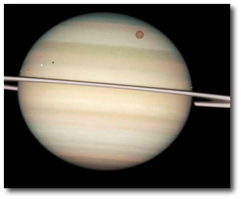
Enceladus, Dione, Titan, Mimas and Saturn.

On Tuesday, Venus reaches its maximum elongation of 46 degrees from the Sun. Thereafter, its angular separation from the Sun steadily decreases until June 6th, when it undergoes transit.

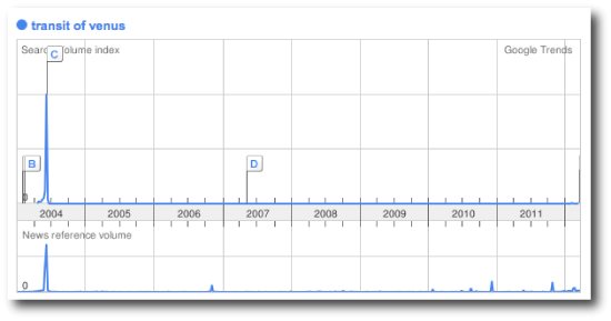
Transits of Venus are newsworthy because they are rare. Venus’ orbit is inclined by 3.4 degrees relative to the ecliptic, and so Earth must be near Venus’ nodal line if a transit is to be observed. The last one occurred in 2004, and the next one after June 6th will occur in December 2117. When talking transits-of-Venus in this day and age of astronomers flossing their “premium-platinum” frequent flyer status, it’s hard to resist that obligatory mention of Guillaume Le Gentil, whose unsuccessful expedition to observe the 1761 transit took 11 years, and had him returning to Paris in October 1771, only to find that he had been declared legally dead and been replaced in the Royal Academy of Sciences. His wife had remarried, and all his relatives had “enthusiastically plundered his estate.”

Nobody’s estate gets enthusiastically plundered on account of transits of the solar system’s Jovian planets by the solar system’s Jovian satellites. Many of the larger moons of Jupiter, Saturn and Uranus orbit with very small inclinations to the host-planet equatorial planes. As a result, it’s possible to get pictures such as the splash image for this post, with a whopping 4 moons transiting at once, without having to wait around for centuries.

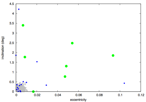
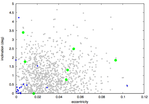
Loosely speaking, eccentricities and inclinations are dynamical bruises acquired during the formation process. When the assembly of a system occurs in a quiescent, dissipative setting, then orbits wind up closer to circular and closer to co-planar. Violent interactions in the absence of dissipation produce systems that are more distended. To get a feeling for this, I gave a 3D-normal distribution of random impulsive kicks with standard deviation 0.003*v_circ to an aggregate of initially co-planar and circular orbits. The resulting distribution of inclinations and eccentricities, plotted as a locus of gray points, is reminiscent of the bulk of the Jovian satellites (blue points):

Cranking up the magnitude of the impulsive kicks by a factor of ten yields a distribution of eccentricities and inclinations that looks better suited to the actual planets in our solar system (green points). Note that Mercury and Iapetus fall outside the diagram.

The big surprise from the Kepler mission has been the large number of systems that display multiple transiting planets. Kepler sees plenty of set-ups that contain four, five, and even six individually transiting planets. This distribution is startling, however, only if one draws on the solar system as the template for expectations. Had the preconceived notions been drawn from the regular satellite systems of the Jovian planets, then the statistics would seem completely unsurprising.

A recent preprint by Figueira et al. describes a consistency analysis between the results of the HARPS and Kepler surveys. They find that the two distributions can be reconciled (and the large number of multiple-transiting planet systems accounted for) if planet-planet mutual inclinations are generally less than one degree.

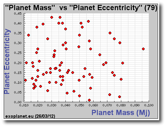
This implies that the eccentricity measurements that have been published to date for low-mass planets are likely to contain a substantial number of overestimated e‘s…

some real alpha

Kraftwerk will be playing eight shows in April at the MOMA, but all eight sold out well before I even found out about it. Getting clued in at this late date is a bit like finding out about a new hot Jupiter orbiting a 14th magnitude star — given that its already March 2012, it’s marginally (or not even) publishable on its own.

The ability to make good predictions prevents one from being perennially late to the game. A good prediction is one that has both accuracy and utility, and for the past two decades, the field of extrasolar planets has been sorely lacking in predictions that make good on either virtue. Yet it didn’t have to be that way! Like many others, in the early 1990s, I was perfectly well aware of Goldreich and Tremaine’s 1980 paper which lays out the essential principles of disk migration.

Even if one only read the abstract, it was very clear that the prospect of Jupiter-like planets on short-period orbits was well worth exploring further. Another example is provided by the Kozai mechanism, that relatively straightforward phenomenon first described in the early 1960s that derives directly from the physics and assumptions underlying the circular restricted three-body problem. With simple models for tidal dissipation thrown in, it could have been clear long ago that visual binary stars have the ability to produce Jupiter-like planets with orbital periods of order a week.


Admittedly, to hear such grousing and second-guessing is like sitting next to a losing bettor on the train back from the track. The productive approach is to keep an eye open to all the equally starting predictions that are yet to be made and which can potentially lead to substantial future profits.

With that lead-in in mind, its very interesting to read the recent abstract of Perets, Kratter and Kenyon (which, I’m told, will soon be followed-up by a substantial paper). Perets and collaborators run up the score with a basic point that definitely falls in the should have thought of that myself category: Mass loss in binary evolution alters the zero-velocity surfaces available to a planet that starts life stably in orbit about one member of a binary pair. As the system experiences stellar evolution, with one or both stars losing substantial mass to red giant winds, a planet is able to radically alter its trajectory, and indeed, can wind up orbiting the opposite member of the pair. Tidal friction can then be invoked to elicit a permanent capture.

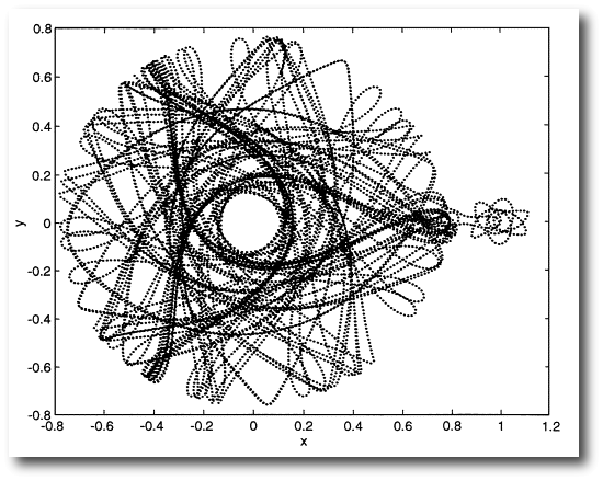
There’s a cool paper by Elbert E.N Macau from 2000 which draws on a similar idea to put a spacecraft on a low-cost slow-boat trajectory to the Moon. In this case, the impetus is provided by a weak rocket rather than mass loss, but the principle is similar:

Figure 4 from Macau, E. E. N. Acta Astronautica 47, 12, 871-878: Starting from a circular parking orbit around the Earth, a thrust is applied to inject the spacecraft into a chaotic region. The spacecraft is then left to move freely in the chaotic region. The uncontrolled trajectory can eventually reach the Moon. In this example, it takes approximately 8 years to reach the vicinity of the Moon. However, after that, the spacecraft quickly leaves the Moon.

Perhaps the most interesting aspect of planetary orbital transfer in evolving binary systems is that it provides a plausible mechanism for delivering Earth-sized worlds to long-lived potentially habitable orbits in the vicinity of white dwarfs. As described in this post from last July, such worlds, when they transit, can be detected from the backyard…

lights in the sky

It’s hard to miss Jupiter and Venus in the early evening sky right now, and later this week, on March 15th at 10:37 UT, they will reach an impressive conjunction, with Venus near maximum elongation (separated by 46 degrees from the Sun) and Jupiter only 3.3 degrees from Venus.

At the time of conjunction, Venus will have an apparent magnitude of V=-4.2 and Jupiter will be at V=-1.9. They are thus both brighter than Sirius, and the display is all the more impressive because the planets are still well above the horizon at the end of astronomical twilight.

The combination of the HARPS Survey and the Kepler data are indicating that the architecture of our solar system is — to at least a modest degree — somewhat unusual. If we were living in a run-of-the-mill planetary system, we could expect to have several planets with ~2x Earth’s radius orbiting with periods of 100 days or less, along with no Jupiter in a Jupiter-like orbit. A pair of standard-issue sub-Neptunes would appear substantially brighter than Venus in the dusk and dawn skies, but night-time displays as impressive as the one we’ve got now wouldn’t occur, since the maximum elongations would be ~30 degrees or less.

Jupiter’s distance from the Sun puts the regular motions of the Gallilean satellites just outside the reach of naked-eye observability, and in a similar vein, Venus’ size and semi-major axis leave it just on the threshold of displaying visible phases. If our eyes were just a little better, the “Copernican Revolution” wouldn’t be a cliche, and Archimedes would have come up with the Universal Law of Gravitation.

Our night sky does, however, give us one very nice order-of-magnitude foothold. The apparent brightness of the outermost visible planet, Saturn, falls exactly in the magnitude range populated by the brightest stars. For example, when Saturn’s rings are at a less-than-full opening angle, the planet has a nearly identical apparent brightness to Alpha Cen A. This means that if one knows the AU, has the telescopic ability to resolve the disk of Saturn, and makes the (shaky) assumption that the brightest stars are Sun-like, and the (less shaky) assumption that Saturn is highly reflective, the distances to the nearest stars can be estimated. Very roughly,

which is close to the true 4.4 light year distance. (A version of this argument was used in the late 1600s to get the first real estimate of the staggering separations between the stars.)

If one also assumes that stars travel at relative speeds that are similar to the velocities with which the planets orbit the Sun, then an extension of the ball-park argument indicates that the configuration of the night sky should be radically altered on a timescale of millions of years. This is indeed the case. There was a cool 1998 article in Sky and Telescope that used the (then-new) Hipparcos data to compute the brightest stars within the last and next five million years. At the dawn of the Pliocene era, Epsilon and Beta Canis Majoris were both of similar brightness to Venus.

Data Graphics


There’s an interesting article in today’s New York Times about Brewster Kahle’s archiving efforts. In addition to founding the Wayback Machine to catalog historical snapshots of the near-complete Internet, Kahle is also Noah’s Arking print books in forty-foot shipping containers.

The Internet Archive’s records for the Extrasolar Planet Encyclopedia (now at exoplanet.eu, but formerly at http://www.obspm.fr/encycl/encycl.html) stretch back to 22:58:15 October 9th, 1999, at the frenetic height of the Internet bubble.

It was a very different world back then. All of the salient details of the galactic planetary census could be jotted down on an index card:

Fast-forward to the Rightnow Machine. There are roughly 3,000 extrasolar planets known, and the Kepler Mission’s latest public candidates table contains various stellar, planetary, and orbital measurements related to 2,323 “objects of interest”. The uncompressed ASCII file containing the table is 454Kb, which, in a certain sense, is a fairly significant amount of data. It would take a week or two (~80 hours) of full-time effort to write that table out by hand. Certainly, it contains enough information to generate numerous exploratory diagrams that seek correlations — diagrams that seek to explain.

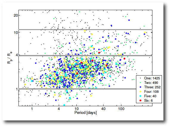
For example, as shown in the Batalha et al. paper, when the radius ratio-period diagram is color-coded with the number of observed transiting planets in the system, it is clear that that the hot Jupiters are predominantly singletons. That’s a point of evidence in favor of production mechanisms such as Kozai Cycles with Tidal Friction, which don’t go along to get along where the smaller planets in the system are concerned.

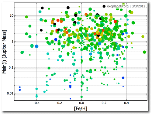
With all those records and all those fields, one naturally makes an effort to increase the dimensionality by coloring and sizing the points. Exoplanet.org provides a very flexible facility for exploring along these lines. In the following plot, the color scale is keyed to the mass of the parent star and the point size is keyed to the logarithm of the orbital period.

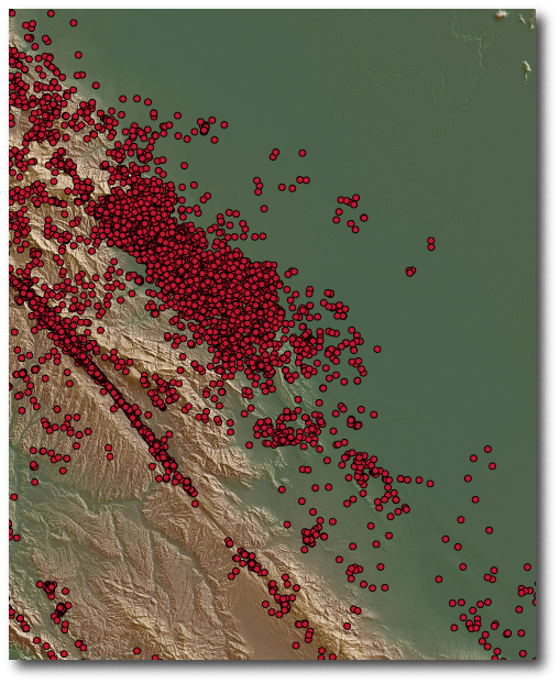
Edward Tufte has repeatedly stressed that a really good data graphic is one that rewards careful study. In my view, the gold standard for such diagrams are high-resolution maps that combine seismographic event data with a Digital Elevation Model.

The above diagram shows California seismicity over the past several decades, combined with elevation data from the Shuttle Topography Mission. Like the exoplanet diagrams, it shows curious clusters of points. The correlations with the physical landforms are fascinating, and it’s interesting to study the diagrams while imagining that our understanding of the Earth system is only at the level of our understanding of extrasolar planet formation and evolution. In some places, such as along the San Andreas Fault, it is clear that the topography and seismicity are inextricably linked. In other places, however, similar landforms are bereft of any Earthquake epicenters. Why the huge cluster near Mendocino? The diagram is incredibly good at setting the mind to work. What’s going on with that completely quiet section of the San Andreas fault?

There is interesting potential, furthermore, for improvement in these particular diagrams with respect to the display of the seismic information. Earthquake magnitudes and times, for example, are not indicated, and the red data points have immense overlap in the seismically active regions. The real depth of the diagrams is generated by the topographic data, in which shading is keyed to gradient, and color is keyed to elevation, an incredibly effective way of increasing dimensionality.