
The photometry from the Kepler Mission stopped flowing a while back, but results from the Mission will likely be arriving for decades to come. It’s interesting to look at how the mass-density diagram for planets is filling in. The plot below contains a mixture of published planets scraped from the database at exoplanets.org, as well as a fairly substantial number that haven’t hit the presses yet, but which have been featured in various talks. The temperature scale corresponds to the equilibrium planetary temperature, which is a simple function of the parent star’s radius and temperature, and of the planetary semi-major axis and eccentricity. The solar system planets can be picked out of the diagram by looking for low equilibrium temperatures and non-existent error bars.
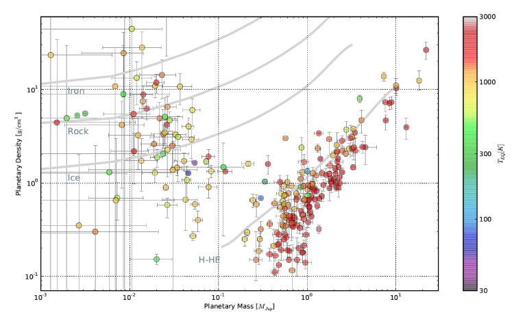
It’s especially interesting to see the region between Earth and Uranus getting filled in. Prior to 2009, there were no density measurements for planets in this region, and prior to 2005, there were no known planets in this region. Now there are a couple dozen measurements, and they show a rather alarming range of sizes. A lot of those “terrestrial” planets out there might not be particularly terrestrial.