March of Progress

Screen-Shot-2015-12-29-at-5.35.59-PM

For many years, and irregardless of the audience, one could profitably start one’s talk on extrasolar planets with an impressive plot. On the y-axis was the log of the planetary mass (or if one was feeling particularly rigorous, log[Msin(i)]), and the x-axis charted the year of discovery. The lower envelope of the points on the graph traced out a perfect Moore’s Law trajectory that intersected one Earth mass sometime around 2011 or 2012. (And rather exhiliratingly, Gordon Moore himself was actually sitting in the audience at one such talk, back in 2008.)

But now, that graph just makes me feel old, like uncovering a sheaf of transparencies for overhead projectors detailing the search for as-yet undiscovered brown dwarfs.

By contrast, a document that is fully-up-to-date is the new Kepler Catalog Paper, which was posted to arXiv last week. This article describes the latest, uniformly processed catalog of the full Q1-Q17 Kepler data release, and records 8,826 objects of interest and 4,696 planet candidates. This plot, in particular, is impressive:

Screen-Shot-2015-12-29-at-5.24.05-PM

For over a decade, transits were reliably the next big thing. At the risk of veering dangerously close to nostalgia trip territory, I recall all the hard-won heat and noise surrounding objects like Ogle TR-86b, Tres-1 and XO-3b. They serve to really set the plot above into a certain context.

Transits are now effectively running the exoplanet detection show. Much of the time on cutting-edge spectrographs — HARPS-N, HARPS-S, APF, Keck — is spent following up photometric candidates, and this is time-consuming work with less glamour than the front-line front-page searches of years past. Using a simple, admittedly naive solar-system derived mass-radius estimate that puts the best K-feet forward, the distribution of Doppler radial velocity amplitudes induced by all the Kepler candidates looks something like this:

figure_KeplerKs

Given that one knows the period, the phase, and a guess at the expected amplitude, RV detections of transiting planet candidates are substantially easier to obtain than blue-sky mining detections of low-amplitude worlds orbiting nearby stars. Alpha Centauri is closed for business for the next block of years.

Question is: During 2016, will there be a peer-reviewed detection of a Doppler-velocity-only planet with K<1 m/sec? Head over to Metaculus and make your prediction count.

Recipes

Screen-Shot-2015-12-25-at-1.45.38-PM

Spontaneous generation, the notion that life springs spontaneously and readily from inanimate matter, provides a certain impetus to the search for extrasolar planets. In the current paradigm, spontaneous generation occurs when a “rocky planet” with liquid water is placed in the “habitable zone” of an appropriate star.

The general idea has a venerable history. In his History of Animals in Ten Books, Aristotle writes (near the beginning of Book V):

Screen-Shot-2015-12-25-at-1.40.35-PM

Aristotle provides little in the way of concrete detail, but later workers in the field were more specific. Louis Pasteur, in an address given in 1864 at the Sorbonne Scientific Soiree, transcribes recipes for producing scorpions and mice elucidated in 1671 by Jean-Baptiste van Helmont:

Carve an indentation in a brick, fill it with crushed basil, and cover the brick with another, so that the indentation is completely sealed. Expose the two bricks to sunlight, and you will find that within a few days, fumes from the basil, acting as a leavening agent, will have transformed the vegetable matter into veritable scorpions.

If a soiled shirt is placed in the opening of a vessel containing grains of wheat, the reaction of the leaven in the shirt with fumes from the wheat will, after approximately twenty-one days, transform the wheat into mice.

There is a certain similarity to the habitable planet formula for the spontaneous generation of extraterrestrials — wet and dry elements combined for sufficient time give rise to life.

In his address, Pasteur goes on to describe his own forerunners of the Miller-Urey experiment, in which he sought to determine whether microbial life is spontaneously generated. He placed sterilized broth in swan-necked beakers that allowed the free circulation of air, but which made it difficult for spore-sized particles to reach the broth. His negative results were instrumental in dispatching the idea of Earth-based spontaneous generation of microbes from scientific favor.

Screen-Shot-2015-12-25-at-2.17.16-PM

A model for Enceladus? Before devising his swan neck flask experiments, Pasteur sealed flasks containing yeast water from air. The one above remains sterile more than 150 years on.

K2

Screen-Shot-2015-12-18-at-6.16.21-PM

Everyone’s heard the cliché about lemons and lemonade. NASA’s K2 Mission exemplifies it.

For brighter stars, the photometric light curves from K2 have precision on par with the original mission, and the data is completely free for everyone to look at. No secret repositories, no loose lips sink embargoed publications. Individual planets are so numerous that they are beginning to resemble the pages of names in a phone book. Six years ago, the light curve for EPIC 210508766 with its uninhabitable 2.747d and 9.997d super-Earths would have been cause for non-disclosure agreements and urgent Keck follow up. Now, given the ho-hum V=14.33, these planets will wind up as anonymous lines in a catalog paper — weights for gray scale dots in big data plots. Mere dimidia:

Screen-Shot-2015-12-19-at-4.25.38-PM

Screen-Shot-2015-12-19-at-4.25.25-PM

(EPIC 210508766 b and c, discovered earlier this week by Songhu Wang and Sarah Millholland)

A few years ago, I wrote a number of posts about a “valuation” equation for getting a quantitative assessment of the newsworthiness of potentially habitable planets. The equation folds qualities such as planetary size, temperature and proximity into a single number, which is in turn normalized by the dollar cost of the Kepler Mission.

valueEqn12152015

The equation, when thoughtlessly applied to Earth, nearly got me into serious hot water when the now-defunct News of the World ran a story with it (which stayed, fortunately, behind a pay wall).

Now that Kepler’s prime mission has been complete for a substantial period, it’s interesting to calculate the values implied by the equation for the up-to-date table of Kepler’s KOI candidates. The cumulative sum runs into the tens of millions of dollars, with single objects such as KOI 4878.01 exceeding $10M. Such worlds are truly the candidates that the Kepler Mission was designed to find.

With K2, which has many bright M-dwarfs within its sites, it’s quite plausible that some very high-profile planets will soon turn up. I’ve set up a K2 prediction market at metaculus.com that canvases the likelihood that such a discovery is imminent…

Sign up and make your prediction count!

The IAU Exoplanet Names

Screen-Shot-2015-12-15-at-11.06.16-AM

If nothing else, the extrasolar planets comprise a thoroughly alien cohort, albeit one that is hitched awkwardly to a naming scheme of utilitarian expedience: Tres-4b, Gliese 876e, HD 149026b, and so forth.

When it comes to exoplanets, I’m somewhat chagrined to realize that I fall into the old timer category, and so predictably, back in the old days, I stuck up for the conservative, default naming convention. In this post on exoplanet names back in 2008, I wrote:

A sequence of letters and numbers carries no preconception, underscoring the fact that these worlds are distant, alien, and almost wholly unknown — K2 is colder and more inaccessible than Mt. McKinley, Vinson Massif or Everest.

The International Astronomical Union, however, just issued official crowdsourced names for 31 exoplanets.

Some of them might take a some getting used to. Fortitudo, Orbitrar, Intercrus. “Son, that’s not 51 Peg b, that’s Dimidium.”

So will the names come into general use? I’ve set up a prediction market at our new website Metaculus to determine whether or not it’s likely:

www.metaculus.com/questions/38/

What do you think? Sign up and make your prediction count…

How did they get there?

Screen-Shot-2015-11-28-at-5.51.30-PM

There are of order 500 million hot Jupiters in the Milky Way. Swollen and massive, with blisteringly short periods, they crowd the tables and the diagrams showing extrasolar planets. The first of their number were career-cementing front page news, trophies of planet roving planet hunters. Two decades on, they slip into the census with little fanfare and less notice.

Conventional wisdom holds that hot Jupiters form at large, Jupiter-like distances, where water ice is stable and where the orbital clock runs slowly. Then they migrate radially inward, either gradually, by interacting with the disk that produced them, or, even more gradually, via the Kozai process, or perhaps, violently, as a consequence of dynamical instabilities that toss giant planets to and fro.

When the first hot Jupiters were discovered, their presence was so strange, so unpredicted and so uncomfortable that there was a certain need for a point of contact with the familiar. It seems more sensible that a planet should form in the right environment and then go astray, rather than defy odds and logic to emerge spontaneously in a location where it obviously shouldn’t be. It’s a short leap from the Copernican principle to the idea that the Solar System has no special distinction. We have nothing orbiting at forty days, not to speak of four.

hJformBBL2015

Yet there is a tantalizing gap in the mass-period diagram that hints that short-period super-Earths that reach fifteen or more Earth masses might engage in rapid gas accretion. Such promotions need happen less than once in a hundred tries. In the spirit of trying to go against the grain, in the perverse hope of eliciting a paradigm shift, Konstantin, Peter B. and I have been working to make the case that many hot Jupiters might just form where they’re found.

The details are all in a paper that we just posted on arXiv.

Self Portrait

Screen-Shot-2015-07-14-at-8.49.23-AM

Image Source

The New Horizons probe just flew through its closest approach to Pluto, and is executing its minutely detailed plan. Fingers on keys and its robotic spirochetes are spacelike-separated events.

The detail in the most recent photograph of Pluto — radioed as an assurance of success in the event that something hit the spacecraft during the last few hours — leaves the impression of a world that has been painted. Eons of weak geysers, subtle rarefied winds, and the sepia tones of photochemistry have combined to produce the illusion of shadow, oil pigments and diffuse lighting that eerily evoke this newly discovered portrait by Rembrandt.

Screen-Shot-2015-07-14-at-7.31.36-AM

closer

Screen-Shot-2015-07-09-at-12.40.33-PM

First thing every morning, I check the raw images from New Horizons. Today there is a fresh set. The Independence Day glitch has been left millions of miles behind, and only days remain until arrival.

Pluto’s current remove seems to lie at a point of heightened mystery. Mottled patches and curiously regular features are starting to fill the frame.

Screen-Shot-2015-07-09-at-12.30.52-PM

The detail seems reminiscent of Mars seen through a refracting telescope, and brings to mind Percival Lowell’s drawings that combined real features and artifacts in a tantalizing juxtoposition.

Screen-Shot-2015-07-09-at-12.30.14-PM

Lowell’s drawing is from 1894. It was still a lifetime — seventy years — before Mariner 4 rushed past Mars and radioed cratered, disappointing close-ups of of the Martian surface. Undaunted, I rode my paper route during the early summer of 1976, concocting vivid premonitions that the first pictures from the Viking I lander would provide some shocking, irrefutable vista of fossils, sandblasted ruins and crashed saucers.

A more quantitative, but effectively similar vein of speculation informed this article by Loeb and Turner from a few years ago:

Screen-Shot-2015-07-09-at-1.25.11-PM
Screen-Shot-2015-07-09-at-1.25.18-PM

We need wait only another hundred hours or so if there is to be a view of Pluto’s lit-up cities of the night.

Pluto

LooksLikePluto

This morning, June 21, 2015, a Google image search for Pluto brings forth inane cartoon dogs, blurry, best-effort HST images, over-the-top space-art landscapes, and a selection of shiny photo-realistic globes, clearly influenced by Ganymede, Io, and Triton.

Screen-Shot-2015-06-21-at-12.07.52-PM

The New Horizons spacecraft, on its ballistic pinpoint trajectory, is just 22 days, 16 hours, 14 minutes from arrival at Pluto, devouring its ever-shrinking gap at 30,800 MPH. A remarkable recent movie posted by the Mission Controllers imparts enough detail to see by eye that the system is tidally despun. And with the targets still effectively at infinity, the scale of the bodies and the orbit is perfectly illuminated. Perspectives during the encounter will use foreshortening and narrow field of view to optimal effect, obscuring the fact that any system with an orbital time scale of order a week is, when taken as a whole, of order dozens of times less dense than air. Effectively just empty space.

In less than a month, the same Google search will be dominated by a small handful of thousand-fold improved images, possibly even by a single best photograph impressed in the camera’s eye during the dramatic needle-threaded moment of urgency.

Pluto’s cultural status made the mission possible. Perhaps the spacecraft will reciprocate with image that will become a touchstone, a visual shorthand for distance, isolation, frigidity and exile.

Ceres

Screen-Shot-2015-03-10-at-9.18.11-AM

I was struck by the image that NASA released several days ago, just before the Dawn Spacecraft braided itself into orbit around Ceres.

From a graphic standpoint, the photograph is perfect. The black expanse relays that the asteroid belt, and by extension the solar system, are mostly empty. Even more subtle is the message telegraphed by the crescent phase. We arrive to our first clear view of this world as outsiders, from a distance further from the Sun than Ceres itself. A consequence of the energetics and the constraints of the trajectory design to be sure, but metaphoric nonetheless.

Electra

FullSizeRender2222015
Have you noticed that the Internet can seem slow? Sometimes it takes a long time for web pages to load. It would really be better if they would just snap up instantly on the screen.

In practice, “instant” response occurs if the latency is less than ~1/30th of a second, or ~30 msec. Animation at thirty frames per second looks smooth. Only a small minority of the population has the retinal read-out frequency required to see that the Crab pulsar is flashing at 33.5 msec intervals.

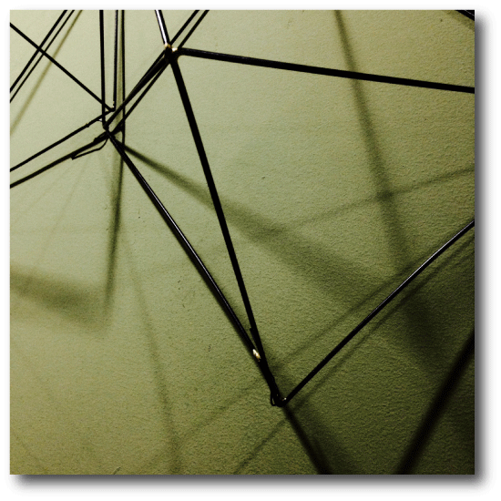
Coincidently, the speed-of-light travel time along the (almost entirely overland) great circle route between Tokyo and New York is (to within a millisecond) the same as the Crab Pulsar’s current spin period. In theory, it should possible to load Japanese-sourced web pages with barely perceptible latency, as the service of a request involves a round-trip.

Screen-Shot-2015-02-22-at-5.17.14-PM

The fastest communication between Japan and the West Coast of the United States is via NTT’s PC-1 cable, which runs between cable landings at Ajigaura (near Tokyo) and Harbour Pointe (near Seattle). Round-trip communication on the cable takes 80 msec, which, given that the speed of light in optical fiber is ~1.44x slower than the speed of light in vacuum, indicates that cable must adhere fairly closely to the great circle route beneath the Pacific.

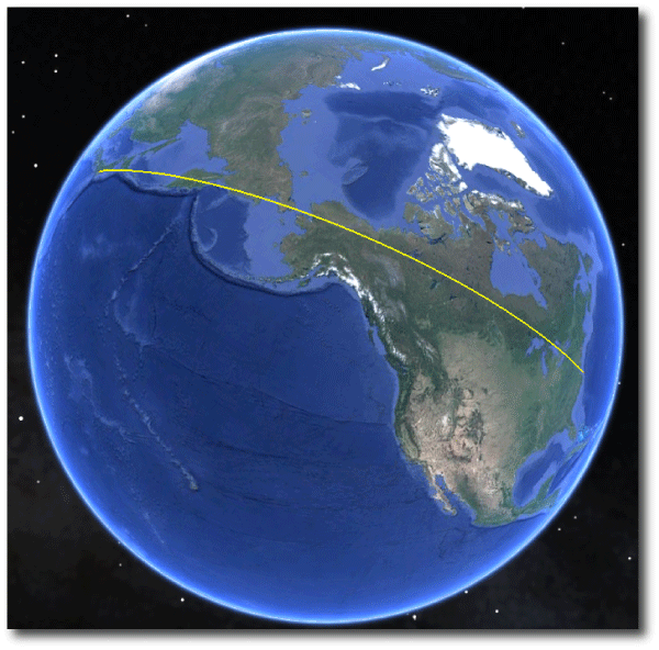
Here’s an interesting paper by Ankit Singla and his collaborators which explores the various drag terms that keep the Internet from actually running at the speed of light. As part of their research, they report on 20+ million measurements of 28,000 web urls served from 120+ countries. The cumulative distribution function of all that pinging points to a median latency for loading html that is ~40x slower than if the message was covering the inferred great circle distance at the speed of light in vacuum.

Screen-Shot-2015-02-22-at-5.52.43-PM

Singla et al. argue that the speed doesn’t have to be so slow:

A parallel low-latency infrastructure: Most flows on the Internet are small in size, with most of the bytes being carried in a small fraction of flows. Thus, it is conceivable that we could improve latency for the large fraction of small-sized flows by building a separate low-latency low-bandwidth infrastructure to support them. Such a network could connect major cities along the shortest paths on the Earth’s surface (at least within the continents) using a c-speed medium, such as either microwave or potentially hollow fiber. Such a vision may not be far-fetched on the time horizon of a decade or two.

Even a decade might be an overestimate. As oklo.org readers know, during the past several years, a secretive fleet of microwave networks have sprung up to transfer information between the Chicago and New York metro areas at as close to the speed of light as possible. The fastest of these networks now transmit within ~2% of the physical minimum. Tremendous efforts have gone into squeezing out every last source of delay.

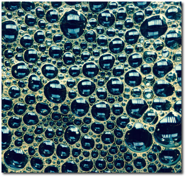
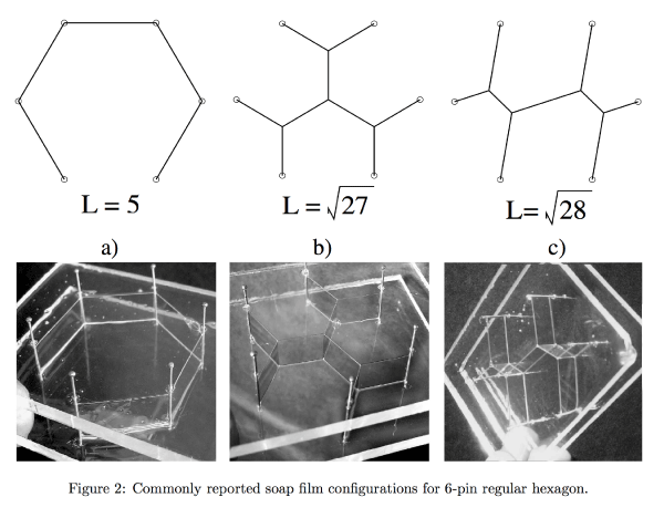
It’s thus interesting to look at what a national low-latency microwave backbone might look like. To optimize on costs, and to minimize connection times, one wishes to connect a number of nodes (metropolitan areas) with the minimal complement of route segments. This task, known as the Steiner tree problem has an interesting history, and computationally, is non-deterministic polynomial-time (NP) hard. One can get analog solutions by placing a board with pegs representing the nodes into soapy water. The connective soap bubble films are physical representations of the Steiner trees:

Screen-Shot-2015-02-22-at-10.03.46-PM

I coded up a Steiner tree finder using an incremental optimization algorithm, and ran it on the top 20 metro areas in the US by populations, which (ranked according to distance from their centroid) are:

1 DFW
2 MSP
3 ORD
4 IAH
5 DIA
6 ATL
7 COL
8 DTW
9 DCA
10 PHX
11 TPA
12 PHL
13 NYC
14 MIA
15 SAN
16 LAX
17 BOS
18 SFO
19 PDX
20 SEA

The algorithm, which employs the Vicenty distance formula between points on the Earth’s surface, and which is not guaranteed to find the absolute shortest route, links the 20 cities with a total path length of 9,814km, about 10x the length of a NYC-CHI route:

Screen-Shot-2015-02-16-at-8.13.20-PM

The added interconnecting nodes on the tree are the Steiner points. A prominent example on the map above connects Dallas and Denver with the Minneapolis-Chicago interconnect point, and lies in an obscure field a few miles south of Haven, Kansas.
Screen-Shot-2015-02-22-at-10.22.12-PM
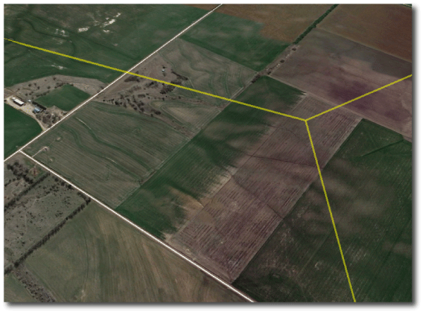
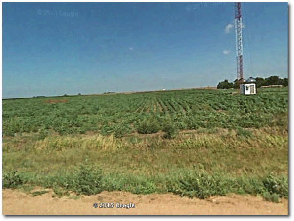
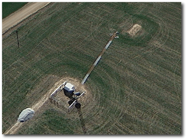
Remarkably, when one zooms in on the exact spot, and settles into street view, there’s a red and white microwave tower a hundred meters or so from the actual Steiner point.
Screen-Shot-2015-02-22-at-10.24.05-PM
Rather fittingly, the tower has three dishes, indeed, pre-aligned and pointing in what appears to be the requisite directions…
Screen-Shot-2015-02-22-at-10.21.49-PM
The Gaia hypothesis, was introduced by James Lovelock in the 1970s and “proposes that organisms interact with their inorganic surroundings on Earth to form a self-regulating, complex system that contributes to maintaining the conditions for life on the planet.”

As the planet wires itself and its computers ever more tightly together in an ever-lower latency web of radio links and optical fiber, it no longer seems like a particular stretch to float an Electra hypothesis in which computational nodes and their interconnections assume a global role comparable to that now filled by the biological organisms.