As more and more extrasolar planets are characterized, the correlation diagrams steadily increase in their intrinsic appeal. Each planet is attached to a number of interesting quantities (planetary Msin(i), period, and eccentricity, and parent star metallicity, apparent brightness and mass, to name just a few).
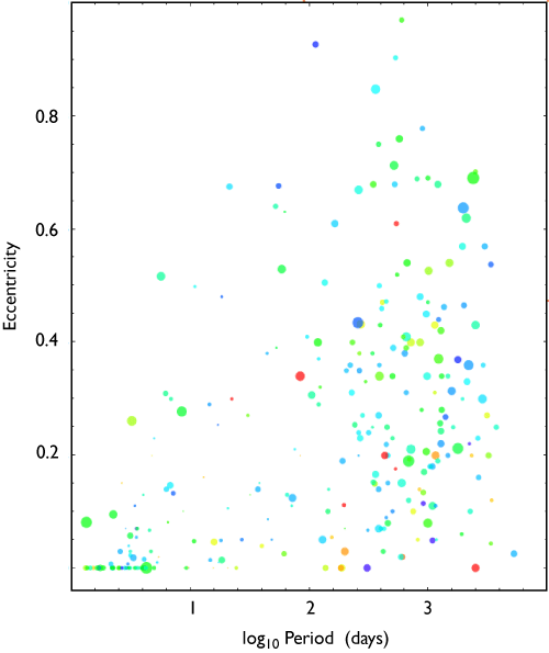
The two most important correlation diagrams are probably the mass-period diagram and the eccentricity-period diagram. Ideally, one would like to plot logM, logP, and e in three dimensions, but I’ve always felt that static 3D diagrams don’t work very well. I think one is best off scaling the size of the symbol to Msin(i) and going with a 2D diagram of eccentricity vs log Period. I fooled around with various scalings, and decided that a point radius proportional to Msin(i)**0.4 looks the best.
That leaves color to impart additional information. As the number of planets increases, one is increasingly better off allowing the points in correlation diagrams to be partially transparent. An opacity of 0.7 give an immediate depth of field for overlapping points, and will continue to work well on Keynote slides until there are more than a thousand planets.
The planet-metallicity correlation can be made evident by mapping the metallicity of the parent star onto the hue of the point. With a rainbow scale where red is Fe/H=-0.5 (low metallicity) and violet is Fe/H=0.5 (high metallicity) it’s immediately clear that the planets found to date are skewed toward metal rich stars.
Looks cool.
The Mathematica Hue command allows control of hue, saturation, brightness and opacity. The HSB color scheme potentially allows for quantities to be displayed simultaneously, meaning that 6D correlation diagrams are possible. Can the saturation and brightness indices be put meaningfully to work?
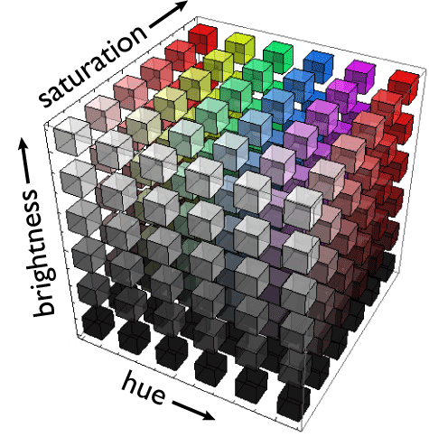
I think the answer is probably yes, but my sense is that it will be tough to get a full return from all three color dimensions. In the diagram below, metallicity maps to hue (as before) and the V magnitude of the parent star maps to brightness. Only hues from 0.00 to 0.70 are used, to avoid the wrap-around. Saturation is left at 1.00 for all points:
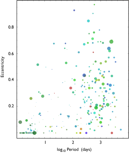
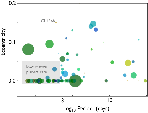
Barfy colors are now in the lead, and some extra information is imparted. The hot Jupiters (in the lower left hand corner of the diagram) are noticeably darker than the eccentric giants. This is because increasingly, the hot Jupiters are being located by transit surveys, which look at much dimmer stars than does the RV method which surveys stars that are typically in the V=5-8 range. The extra color dimension is thus giving a sense of one of the biases in the diagram — Hot Jupiters are overrepresented because they’re easier to find.
What happens when one uses all three color dimensions? In the following diagram, the degree of color saturation is mapped to the mass of the parent star. With the first scaling that I tried, there’s not a whole lot of change from the previous plot. I think, though, that with more experimentation, the color saturation can be put to use. Note, too, that the dynamic range is reduced by the up-front demand for 70% transparency.

The diagrams really benefit from higher resolution. For example, looking at the hot Jupiters, there’s an interesting zone of avoidance at the lower left hand corner. The lower-mass planets are not populating the region that contains the hottest and most circular hot Jupiters. This might stem from a fundamental composition difference, although it’s also true that Neptune-mass planets don’t turn up yet in transit surveys.

The problem with HSB is the degeneracy when saturation and/or brightness = 0 however I guess your system avoids that by restricting the range of parameters. Nevertheless it will still conspire to restrict the dynamic range displayed for certain parameters at extreme values, which may skew things in the chart.
On the other hand, I suspect using RGB wouldn’t give a particularly visually-appealing result…