In trying to make sense of the flood of new Kepler results, the very first order of business is to run through the various scatter plots to get a sense for the distributions, to look for correlations, and to test pet theories.
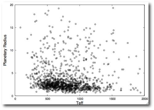
Kevin Schlaufman has made a useful formatted electronic table that joins Tables 1 and 2 from the Borucki et al. (2011) paper. Sifting through this table alone, notwithstanding the gigabytes of light curves currently available for download, there’s lots of very interesting stuff. For example, plotting planetary effective temperature vs planetary radius shows that as expected, there are a lot more small planets than large planets:
If we were looking at a complete volume-limited survey of planets, then this plot would have an interesting interpretation. The downward sweep of the main locus suggests that hot planets, by and large, tend to be smaller than cooler planets. The natural interpretation would be that we’re seeing a signature of evaporation — hence CoRoT-7b, AKA “Planet Freeport-McMoran” is small, whereas Gliese 1214b AKA “Planet Dasani” is relatively large by comparison. (Corporations interested in paying for product placements on oklo.org, please contact me directly.) Sadly, however, before jumping to conclusions, one has to worry about a whole host of possible gotcha-style observational biases. Small planets are harder to detect via transits, meaning that more orbits are required to reach given signal-to-noise, meaning that small planets are more likely to be found on short-period orbits. My gut feeling is that these effects might not be strong enough to completely wipe out the observed correlation, but it’ll take a lot of careful Monte-Carlo work to understand for sure.
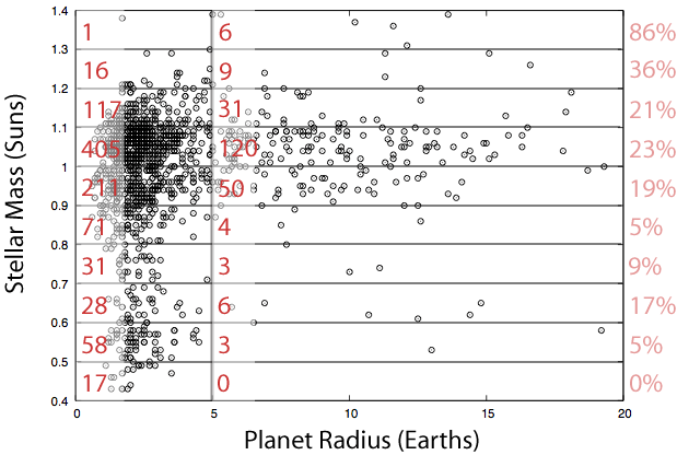
I’ve got some unhedged exposure to the planet-stellar mass correlation. The idea is that if core accretion is zeroth-order correct, then it should be easier to form giant planets in orbit around more massive stars. If this hypothesis is correct, then the giant planet fraction (defined as planets having radii greater than 5 Earth radii divided by the total number of planets) should increase as one increases the mass of the host star. Again, if one lives dangerously, throwing caution regarding biases completely to the wind, this seems to be the case with the 1235 Kepler candidates:


Obviously this impression may change once longer period data becomes available, but at this point, is it fair to characterize our own solar system as unusual due to the lack of planets smaller than Uranus but larger than Earth? It appears that based on the Kepler release, that is the most common size for a planet.
Talking of unusual solar systems, Kepler-11f is a real eye-opener. I’m starting to wonder whether it is unusual to have low mass planets that are built out of rock and iron rather than ice and hydrogen (bar a few evaporated cores in ultra-short-period orbits).
I really would like to perform some statistical analysis on both latest and previous release of Kepler data (that one talking about 750 exoplanets and 140 habitable planets), but I can only find the latest; do you know the exact name/id of june 2010 release documento?
The only arxiv document I found on Kepler from june 2010 only lists around 300 candidates.
Second graph in particular is very interesting, suggesting a kind of lower stellar mass theshold in relation to giant planet formation, plus possibly a (positive) correllation between stellat mass and planet formation in general.
It would also be very interesting to have a similar graph showing planet formation as a function of *stellar metallicity*. Remarkably, I have read very little about metallicity in relation with the recent Kepler results.
Is anything relevant known about metallicity of these Kepler sample stars?
I’m struck by the small number of earth sized or smaller planets found in the habitable zones of low mass stars. It seems that essentially all of those should have been found by now but only 5 have been announced. Since those make up just about 10% of ALL the habitable zone planets released, this seems, at least to me, to indicate that “habitable” planets around low mass stars are much rarer than many had suspected. A rough upper limit of these would seem to be around 5%. I haven’t had time to look thru the papers yet, but surely someone has done this calculation?
@jumpjack
http://arxiv.org/abs/1102.0541
To what extent is the lower radius limit detection-limited, and to what extent is it physical?
Never mind, I figured it out myself.
written up in blog:
http://lablemminglounge.blogspot.com/2011/02/our-planets-are-weird.html
Apart from the most common planetary radius, it is also interesting how the clustering of these planets is around the 1.0 – 1.1 Solar Mass range. Whether this is still prevalent in a much larger sample remains to be seen.
@pete j
The clustering is because of the target selection criteria: they preferentially selected G-type stars.
@Hungry4info2
Thanks, but it’s just the document I was talking about, published in february 2011. I said I need a document which lists the 750 candidate planets and 140 candidate-habitable announced in july 2010.
1006.2799v2 also does not help, it lists just 313 candidates.