
It’s all there on the Wayback Machine. Way back in the early aughts, say 2002, there were a number of efforts that tried to keep track of the then-rapidly expanding exoplanet census. We now know of more than a hundred worlds orbiting alien stars! The go-tos were the Extrasolar Planets Encyclopedia at exoplanet.eu and the California-Carnegie table at exoplanets.org. I was trying to keep up with the big boys by maintaining a table of potential transit ephemerides at transitsearch.org, in an effort that was soon the subject of an official thumbs-down from the NSF.
Eventually, NASA moved on the small players. As far as I can tell, their exoplanet archive is now the definitive site. I long ago let the domain registration for transitsearch.org lapse, and it now appears to be under the control of some sort of zombie AI agent.
I thought it would be cool to let my own zombie AI agents scrape down the exoplanet archive. (Look up “strigil”, and if it’s not already part of your working vocabulary, it soon will be.)
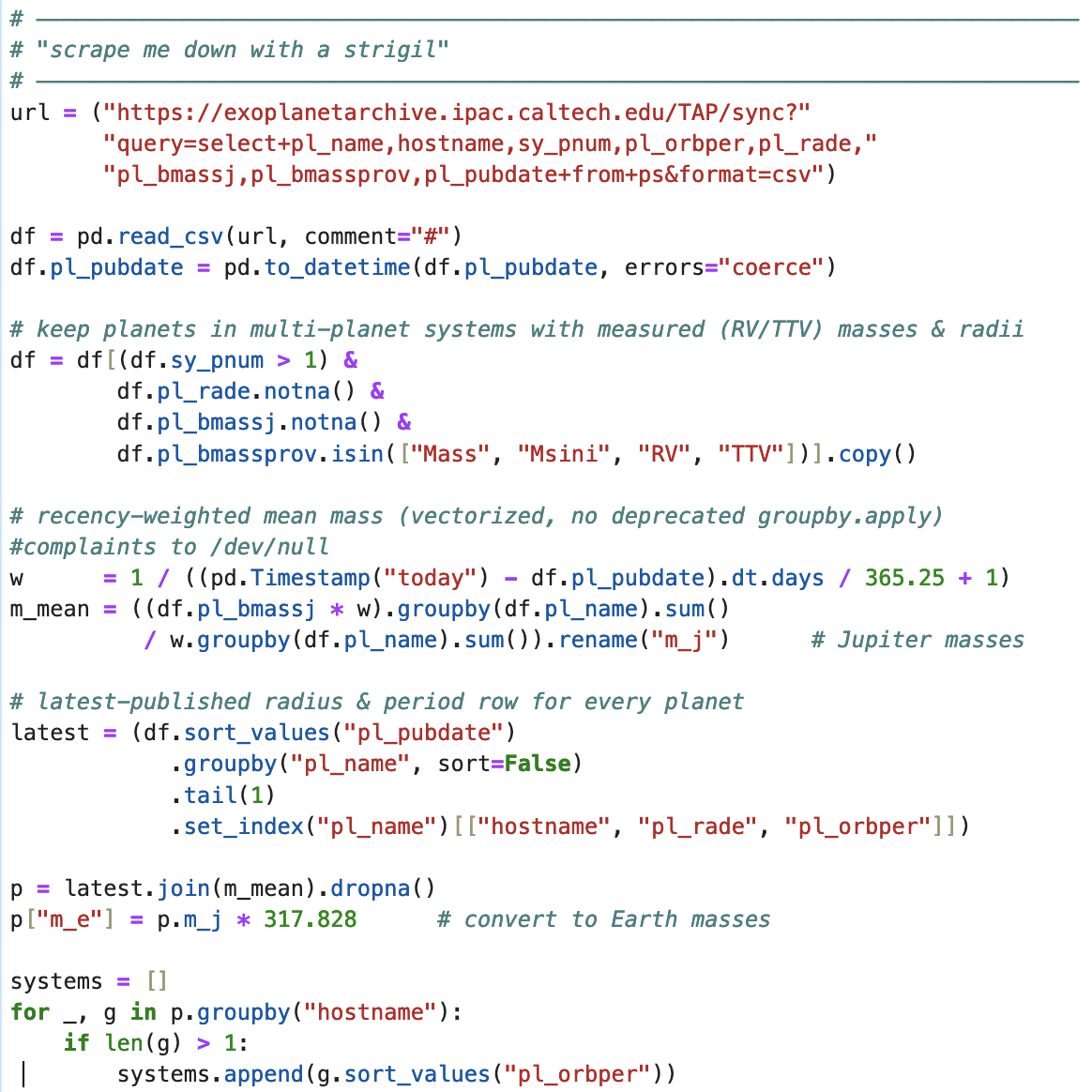
The current table of planets that (1) have both mass and radius estimates and which (2) are members of multiple-planet systems breaks down as follows:
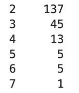
That is, there are currently forty-five qualifying three-planet systems, etc.
Think of the systems as directed graphs in the planetary (log Radius, log Mass) plane. The nodes are planets, the edges connect radially adjacent nodes. The edge direction always points toward increasing semi-major axis. An individual system graph is colored by the period of the inner planet using managua, with clipping bounds at 1 and 100 days. This generates an interesting diagram, and provides a significant density-of-data update to the paper we wrote in 2017.
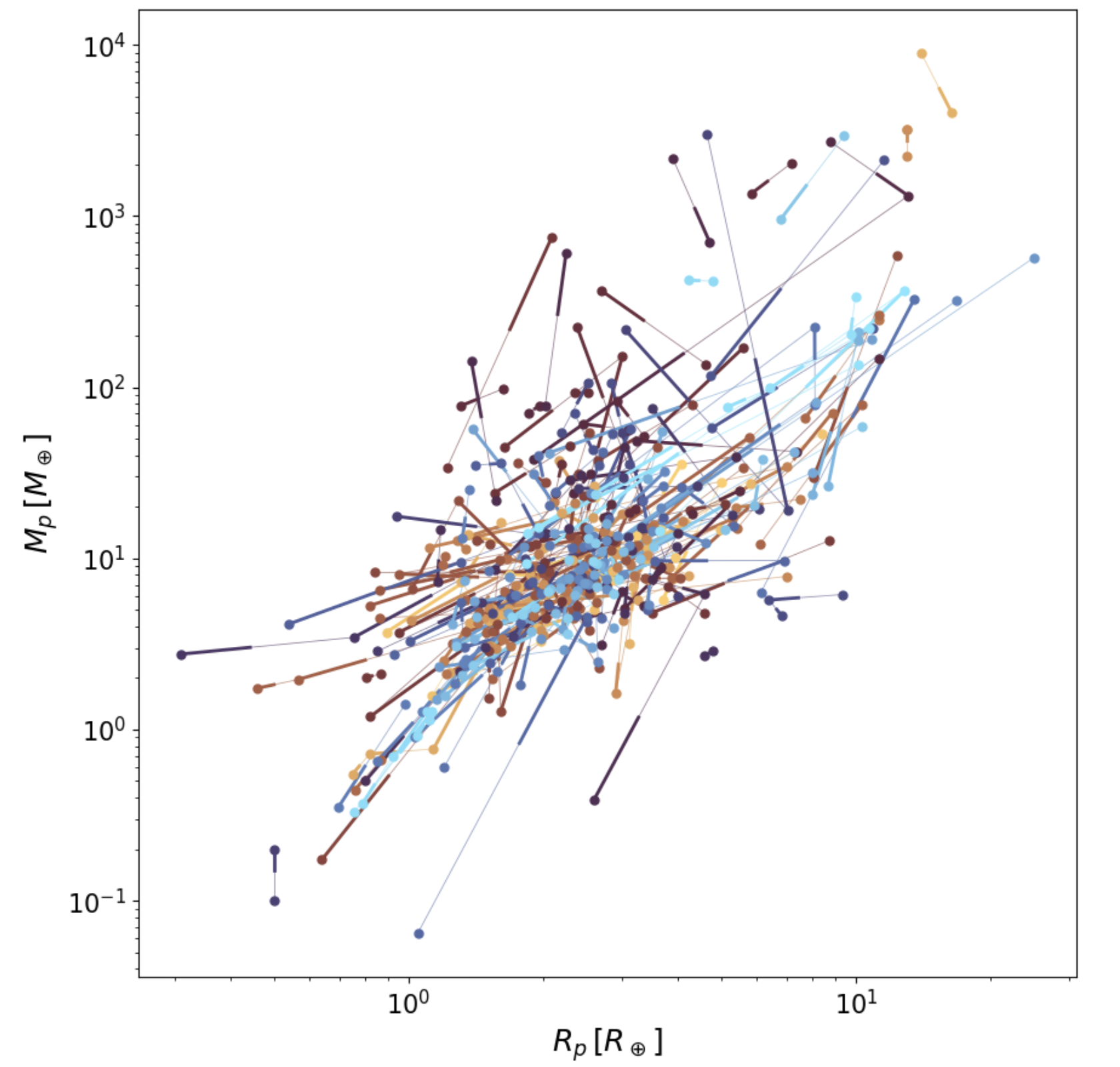
Summing the lengths of all the edges of all the graphs gives a far smaller length than if one shuffles the catalog planets among the aggregate of system slots. That’s the peas-in-the-pods effect that I’m often going on about. What’s more interesting, though, is that the diagram is suggestive of an ordered flow. Part of this comes from the well-known empirical observation that planet masses and radii tend to increase outward. Part also stems from the readily intuited observational biases. Yet there appears to be significance beyond those obvious take-aways.
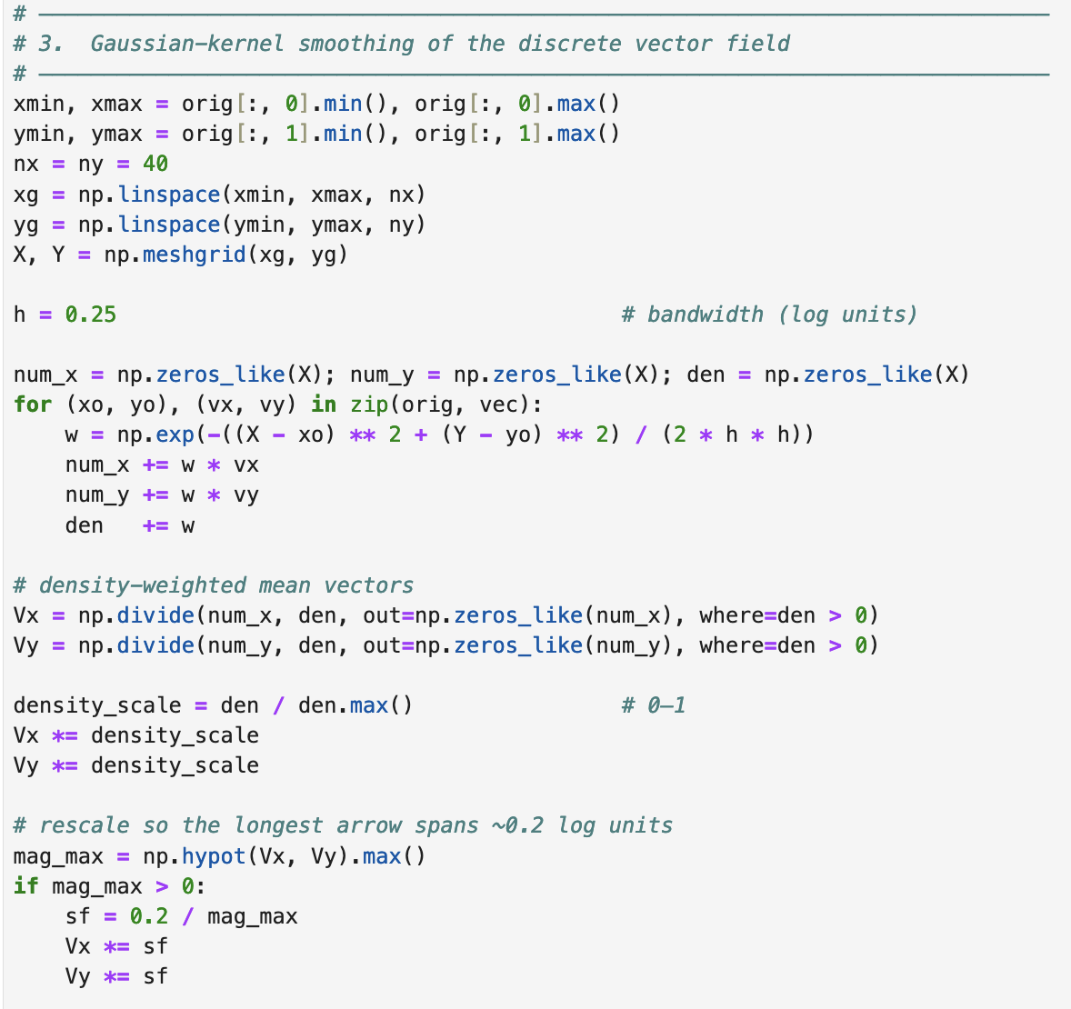
Think of the directed graph edges as point velocity measurements in a compressible flow. In a cold fluid, the bulk motion will be emphasized in comparison to the thermal motion. We can average out the thermal fluctuations by processing the graph edges:
Plotting the bulk flow field along with the planets, again color-coded by the period of the innermost member of the system to which they belong, gives:
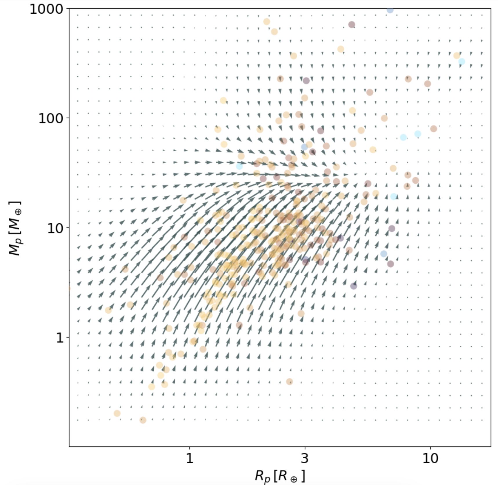
The “sink”, where the divergence of the flow is highly negative, is located near the position where the simulations suggest that runaway core accretion is initiated, which seems suggestive… Or perhaps it’s just a coincidence.