There’s an interesting article in today’s New York Times about Brewster Kahle’s archiving efforts. In addition to founding the Wayback Machine to catalog historical snapshots of the near-complete Internet, Kahle is also Noah’s Arking print books in forty-foot shipping containers.
The Internet Archive’s records for the Extrasolar Planet Encyclopedia (now at exoplanet.eu, but formerly at http://www.obspm.fr/encycl/encycl.html) stretch back to 22:58:15 October 9th, 1999, at the frenetic height of the Internet bubble.

It was a very different world back then. All of the salient details of the galactic planetary census could be jotted down on an index card:

Fast-forward to the Rightnow Machine. There are roughly 3,000 extrasolar planets known, and the Kepler Mission’s latest public candidates table contains various stellar, planetary, and orbital measurements related to 2,323 “objects of interest”. The uncompressed ASCII file containing the table is 454Kb, which, in a certain sense, is a fairly significant amount of data. It would take a week or two (~80 hours) of full-time effort to write that table out by hand. Certainly, it contains enough information to generate numerous exploratory diagrams that seek correlations — diagrams that seek to explain.
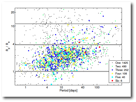
For example, as shown in the Batalha et al. paper, when the radius ratio-period diagram is color-coded with the number of observed transiting planets in the system, it is clear that that the hot Jupiters are predominantly singletons. That’s a point of evidence in favor of production mechanisms such as Kozai Cycles with Tidal Friction, which don’t go along to get along where the smaller planets in the system are concerned.

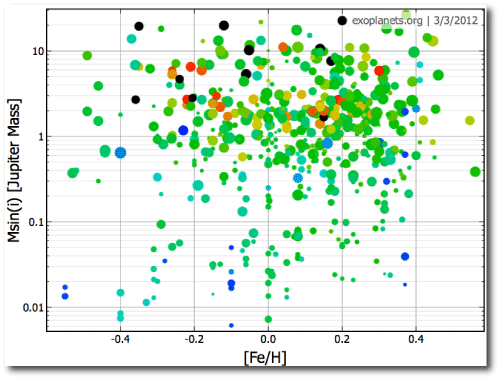
With all those records and all those fields, one naturally makes an effort to increase the dimensionality by coloring and sizing the points. Exoplanet.org provides a very flexible facility for exploring along these lines. In the following plot, the color scale is keyed to the mass of the parent star and the point size is keyed to the logarithm of the orbital period.

Edward Tufte has repeatedly stressed that a really good data graphic is one that rewards careful study. In my view, the gold standard for such diagrams are high-resolution maps that combine seismographic event data with a Digital Elevation Model.
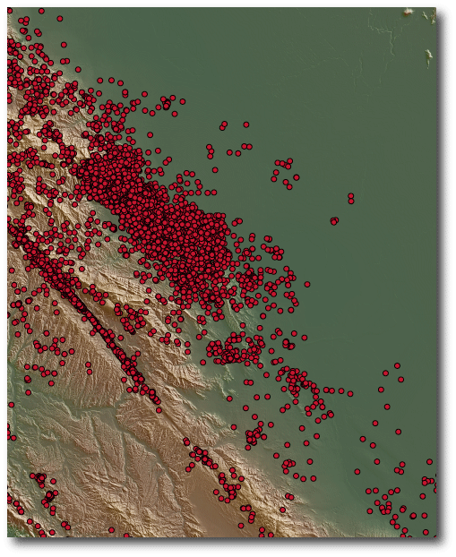
The above diagram shows California seismicity over the past several decades, combined with elevation data from the Shuttle Topography Mission. Like the exoplanet diagrams, it shows curious clusters of points. The correlations with the physical landforms are fascinating, and it’s interesting to study the diagrams while imagining that our understanding of the Earth system is only at the level of our understanding of extrasolar planet formation and evolution. In some places, such as along the San Andreas Fault, it is clear that the topography and seismicity are inextricably linked. In other places, however, similar landforms are bereft of any Earthquake epicenters. Why the huge cluster near Mendocino? The diagram is incredibly good at setting the mind to work. What’s going on with that completely quiet section of the San Andreas fault?
There is interesting potential, furthermore, for improvement in these particular diagrams with respect to the display of the seismic information. Earthquake magnitudes and times, for example, are not indicated, and the red data points have immense overlap in the seismically active regions. The real depth of the diagrams is generated by the topographic data, in which shading is keyed to gradient, and color is keyed to elevation, an incredibly effective way of increasing dimensionality.


Hi Greg,
The cluster near Mendocino is because that is where the triple junction currently is located. The triple junction is where the San Juan de Fuca, Pacific, and North American plates come together. All kinds of interesting stuff happens around a triple junction.
Hot Jupiters might be singletons – or, they may just preferentially exist in systems with higher mutual inclinations (non-coplanar systems)?
So which of that original list still remain as exoplanet candidates? As far as I can tell both Rho CrB b and HD 195019 b have been determined to be stars in low-inclination orbits. Astrometry so far seems to be doing rather better as a planet-killer than a planet-finder!
Matthias: Hot Jupiters beings singletons also makes a lot of sense in view of the postulated inward migration of giant planets, as also mentioned under the post ‘Regular systems of satellites’.