
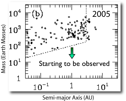
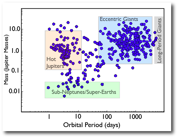
The extrasolar planets constitute a fast-moving field. I was looking at the slides from a talk that I gave in early 2005, in which I showed the then-current, now hopelessly outdated, mass-period diagram for the known extrasolar planets:
At that time, the name “Gliese” had barely edged into the public consciousness, as a Google trends and news reference diagram illustrates:
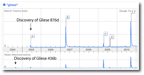
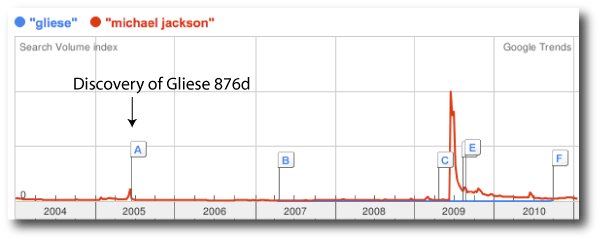
The discovery of Gliese 436b occurred in the summer of 2004, and was the first Neptune-mass extrasolar planet found. The following summer saw the announcement of the first unambiguous “super-Earth”, Gliese 876d, which generated a blip in search volume in addition to news volume. The discovery of Gliese 876d might have been a bigger story, had it not shared a news cycle with Michael Jackson:
In early 2005, there was essentially no hint of the enormous population of sub-Neptune/super-Earths lying just below the threshold of detectability. Population synthesis models for extrasolar planets were doing an excellent job of reproducing the distribution of hot Jupiters, the period “desert”, and the population of eccentric giants, but at that time, the smart-money expectation was that the pickings would be rather slim in the hot sub-Neptune regime. (It was also believed that the detection rate would pick up substantially once truly terrestrial planets became observable.)
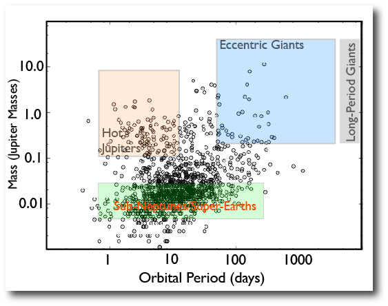
Mayor et al.’s announcement in 2008, therefore, came as a real bombshell. The Geneva Team made the startling claim that a very substantial fraction of stars in the solar neighborhood harbor at least one planet with Neptune mass or less, with an orbital period of fifty days or less. Their claim is equivalent to the statement that in a volume-limited survey, the number of planets in the green box of the diagram below is of order five times greater than the sum of the number in the peach box and the blue box.
In the diagram above, the population of planets known in 2010 is plotted. There’s a bulky cohort of RV-detected eccentric giants (Msin(i)’s), a lot of hot Jupiters from the transit surveys, and a respectable, but still sparse population in the sub-Neptune/super-Earth category. The Geneva claim was based primarily on signals that are emerging in the HARPS data, rather than solid published planets.
Fast-forward to last week. Kepler has suddenly augmented the planetary census by more than a factor of three. If we estimate masses through the simple relation Mpl=Rpl^2, then we can plot the Kepler candidates on the mass-period diagram. Detection biases etc., etc. aside, it’s abundantly clear that there is indeed a huge population of objects in the ground staked out by the Mayor et al. 2008 announcement:

As far as I can see, the Kepler data doesn’t show a ‘Saturn gap’ between the Neptune and Jupiter sized planets. Is this due to Neptunes getting inflated thermally (we are looking at radius, not mass), or do you reckon it is real?
Pingback: Tweets that mention systemic » The Mass-Period Diagram -- Topsy.com